
Open AI used to have a product called Code Interpreter. Which was a name that didn’t make much sense because it doesn’t interpret code. Instead it’s a language model that can ingest CSVs and generate code to do data analysis. So some highly paid marketing persion decided it should be renamed Advanced Data Analysis (ADA).
So does Advanced Data Analysis earn its name? In this post I take a look at the good, the bad and the ugly of working with Advanced Data Analysis. I also consider whether the tool can be used by people with limited data analysis experience.
Want to improve your own data analysis skills? Check out my Polars course with a free preview of the first chapters
The challenge
In my day job I build energy trading pipelines for battery and renewable power systems at The Electric Storage Company. One area we work on are markets - called DC High and DC Low - where batteries earn revenue by helping the electricty grid manage changes in grid frequency due to intermittent renewable generation.
For this analysis I’m going to take the auction results from these markets to see if ADA can help us understand the dynamics of the volume traded and prices achieved in auctions since the markets were launch in 2021.
I started with the following simple prompt to tell ADA we are doing exploratory data analysis with the goal of building a forecasting model:
1
2
3
We want to build a machine learning model to forecast
the volume and price in this dataset. Do an exploratory
analysis to capture the key features of this dataset
The good
ADA sets off in classic ChatGTP style with a verbose re-stating of the prompt followed by an initial inspection of the columns in the dataset.
So far so good. Despite not much info from my the prompt ADA has done a good job of identifying the key columns and their data types. It goes on to do some summary analysis of each column in terms of means, standard deviations etc. So far so good.
Once ADA has done the summary it stops to ask me what I’d like to do next. I tell it I’d like an analysis of trends and seasonality in the price and volume. ADA then chugs slowly away while I grab a coffee. By the time I’m back it has started by making a time series chart.
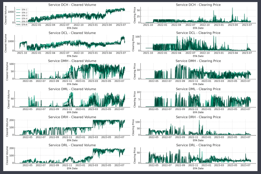
This chart shows the volumes and prices for different markets. It’s a decent plot although the colour scheme makes it very difficult to distinguish between lines. In a later chart I tell it to use a more distinct colour scheme and it does a good job of that.
I continued on with more analysis like this and it went on to produce good summary bar charts and seasonality analysis by month and day of week. Overall it felt like an easy way to do exploratory analysis and I was quickly learning about the dataset.
The bad
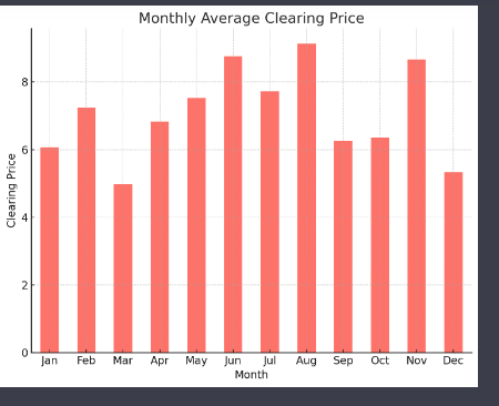
Each chart is followed by some text describing the results in the chart. Take this chart showing the monthly average price.
This is the ADA summary of the chart:
The first part of the summary is kinda true although two of the four months have average prices.
The second part about a rise in the middle months and a decline towards the end of the year is a good summary of the overall annual trend.
However, the last part about September being an exception is flat out wrong - it is November that is the exception.
It feels very tempting to be lazy while ADA is doing most of the work and just trusting that the text summary is correct. But we can’t do that because ADA gets it wrong. This kind of issue - and often with bigger mistakes - happened repeatedly with the text summary of charts. Overall it felt like:
- the summary text tries too hard to find a neat story in messy data
- the ability to pull out detailed features is often wrong
ADA does the analysis using Pandas and plots with Matplotlib. I asked it to work with Polars and Altair instead. Despite its initial enthusiasm for the idea it didn’t work as it doesn’t have these installed in its environment. As a Polars developer I’d find it hard to call a tool that uses legacy technology like Pandas “Advanced Data Analysis”😎
The ugly
Eventually we got onto doing some time series forecasting. At this stage things broke down completely. ADA first suggested some forecasting models:
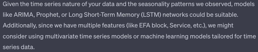
Uh-oh. Prophet? A model that was basically dis-owned by its creators. LSTM? Not a good idea for a simple time series forecasting challenge like this. Or frankly for any time series forecasting challenge. At moments like this that you feel ChatGPT is just serving up the average of thousands of bad Medium articles.
I asked it instead to try with linear regression and gradient boosting. Unfortunately the gradient boosting model it defaulted to is Scikit-learn’s old GradientBoostingRegressor rather than it’s new HistGradientBoostingRegressor or XGBoost.
The greater headache was that ADA ran into continual issues getting code to run. Sometimes this was something simple like ADA was looking for columns in the dataframe it hadn’t created yet. These missing columns required it to go back some steps.
More crushingly it then repeatedly failed to generate part of the way through the modelling. Each failure required it to restart the entire modelling process from the start. The only way to address this was to tell it to break the modelling into smaller and smaller chunks. This worked but it lost the feeling of being an automated process that the initial exploratory analysis had.
Whether these issues were caused by increased load on the server or the increasing length of the chat sequence at this point isn’t clear but it was a frustrating experience.
Automated data analysis?
The other major question I had was whether this tool would allow people with limited data analysis experience to do effective analysis. Initially I looked like it would allow anyone to do worthwhile analysis.
However, as the sequence went on I could see how important my experience was in guiding it to make the right charts, format them correctly and - above all - interpret them correctly. As with general ChatGPT this feels more like a tool for helping people with some experience rather than a tool for people with no data analysis experience.
Verdict
Overall I’ll keep using the tool, particularly for exploratory analysis on a new dataset. I look forward to it broadening the set of tools beyond Pandas and Matplotlib so I can easily incorporate the code it generates into my own workflow. But I will keep a close eye on its output and check it carefully before trusting it.
Next steps
Want to know more about Polars for high performance data science? Then you can: