
Update October 2023
As of Seaborn version v.13.0 Seaborn accepts Polars DataFrames natively🎆. Note that this is not full native support though. Polars copies the data internally to a Pandas DataFrame. To avoid copying your full dataset ensure you only pass the subset of columns you need to do the plot.
While posting on my frustrations with Matplotlib Gaurav Sablok pointed out on LinkedIn that I had overlooked the Seaborn library.
I’ve been using Altair in recent years and so hadn’t given Seaborn much thought. However, I’ve been impressed by Seaborn’s new interface and happy to find that Seaborn will accept Polars DataFrames directly for many plots.
In this post I look at how we can pass a Polars DataFrame to Seaborn for some advanced plots and some other tips for visualisng a Polars DataFrame with Seaborn.
Want to accelerate your analysis with Polars? Join over 3,000 learners on my highly-rated Up & Running with Polars course
Jointplot
One of the advanced Seaborn visualisations is the jointplot. This is a scatter plot of two columns but with the distribution of each column also plotted. In addition we can add a hue field to colour these plots by a third column.
In this example I use the Titanic dataset and do a jointplot of the passenger age and fare paid columns and colour by the passenger class column.
1
2
3
4
5
6
7
8
9
10
11
12
13
14
15
16
17
18
19
20
21
import polars as pl
import seaborn as sns

df = pl.read_csv("titanic.csv")

sns.jointplot(
    data=(
        df
        .with_columns(
            [
                # Take the log of the Age and Fare floating-point columns
                pl.col(pl.Float64).log(),
                # Cast the passenger class column to string
                pl.col("Pclass").cast(pl.Utf8)
            ]
        )
    ),
    x="Age",
    y="Fare",
    hue="Pclass",
)
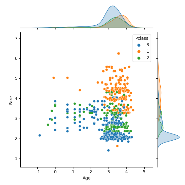
Numerical or categorical?
One common feature of plotting libraries like Plotly or Seaborn is that they infer how the data should be presented based on the dtype of the data. This can lead to charts that display in a confusing way!
In this example we want to colour by the Pclass column for passenger class. The values in this column are 1,2 or 3 and so it has an integer dtype. However, from a plotting perspective this column is really a kind of ordered categorical column rather than numerical. However, because of the integer dtype Seaborn and Plotly see this as a numerical column and try to treat it as quantiative data.
To address this we must convert the Pclass column to a string dtype. We do this in the example above with the expression pl.col("Pclass").cast(pl.Utf8). The charts then display in the way we expect.
Passing a Polars DataFrame leads to a copy of your data internally in Seaborn. To avoid uncessary copying I recommend calling select to only copy the subset of columns required for your chart e.g. df.select(["Age","Fare","Pclass"]).to_pandas.
Next steps
Want to know more about Polars for high performance data science? Then you can: