
From Plotly v5.15.0 onwards Plotly has native support for Polars😊. So you can pass the DataFrame as the first argument and the column names as strings to the x and y encoding arguments. This is a great improvement as it means we can use the Plotly API without having to convert to Pandas first.
Original post: January 2023
While adding a section to my Udemy Polars course on making visualisations with Plotly and Matplotlib I was struck by how much work Matplotlib required. In this post I show a strategy for making plots with different colours in Matplotlib and compare how we can make this chart with Plotly.
I have a fairly long history with Matplotlib. I used it throughout my PhD and postdocs in physical oceanography. However, towards the end of this time I discovered the Altair visualisation library. After a few weeks of experimentation I stopped using Matplotlib as Altair seemed to make nicer plots with less effort. More recently I’ve been using Plotly and found it has similar advantages to Plotly.
Beware: I’m no longer a regular Matplotlib user so there may be better ways to do some things. However, I have taken these approaches from the offical docs.
Scatter plot with colour groups
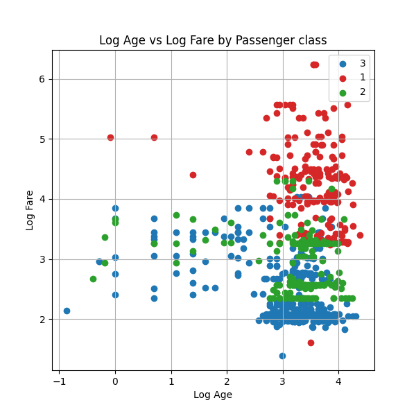
For this example we’ll make a scatter plot of the Titanic dataset. The scatter will be the (log) age of passengers on the x-axis and the (log) fare the passenger paid on the y-axis. We will colour the dots by the class the passenger travelled in. We refer to the different passenger classes more generally as the groups.
Matplotlib
We do this first in Matplotlib. The main challenge in Matplotlib is that we have to:
- pass it a list of colours for the different groups
- loop over the groups adding the data and label for each group individually
We do this loop over the groups with the partition_by method. When we pass the as_dict=True argument we get a dictionary mapping the group key (i.e. the passenger class) to the group DataFrame. This means we get both the group key to be the label in the legend as well as the data. We loop over this dict in the standard Python way using the .items method.
1
2
3
4
5
6
7
8
9
10
11
12
13
14
15
16
17
18
19
20
21
22
23
24
25
26
27
import polars as pl
import matplotlib.pyplot as plt

df = pl.read_csv("titanic.csv")
fig, ax = plt.subplots(figsize=(6,6))
# List of colours for the 3 passenger classes
colours = ['tab:blue', 'tab:red','tab:green']
# Loop through the group keys and group DataFrames with partition_by
for idx,(passenger_class,passenger_class_df) in enumerate(
    df.partition_by("Pclass",as_dict=True).items()
):
    # Get the colour for this group
    color = colours[idx]
    # Add the data for this group to the axis
    ax.scatter(
        x=passenger_class_df["Age"].log(),
        y=passenger_class_df["Fare"].log(),
        c=color,
        label=passenger_class,
    )
# Add metadata
ax.legend()
ax.grid(True)
ax.title.set_text("Log Age vs Log Fare by Passenger class")
ax.set_xlabel("Log Age")
ax.set_ylabel("Log Fare")
plt.show()
This strategy of using df.partition_by works for other Matplotlib chart types such as multi-colour time series charts.
Overall, it feels like a lot of work to have to implement the loop over the groups. I also find that the names of methods to add metadata aren’t intuitive - for example we do ax.title.set_text but ax.set_xlabel.
Plotly
Now we create this same chart with Plotly (using the Plotly Express API). With Plotly we can just pass it the the colour column rather than having to loop over the groups. We can also pass the axis labels and title as arguments to the scatter plot.
The only point to be aware of is that we have to cast the colour Pclass column to the string dtype (pl.Utf8) so that Plotly knows that this data is categorical rather than numerical.
1
2
3
4
5
6
7
8
9
10
11
12
13
14
15
import plotly.express as px

px.scatter(
    x=df["Age"].log(),
    y=df["Fare"].log(),
    # Cast the Pclass to string
    color=df["Pclass"].cast(pl.Utf8),
    labels = {
        "x":"Log Age",
        "y":"Log Fare",
        "color":"Survived"
    },
    title="Log Age vs Log Fare by Passenger class",
    height=600
)
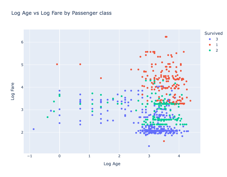
I think that was a lot easier with Plotly. The other advantages of the Plotly are that:
- the API is relatively consistent across plot types
- in Jupyter the plots have interactive tooltips by default
Conclusion
Matplotlib is a powerful plotting tool. However, if you need standard plot types then it may be more than you need. When I make these kinds of charts I use either Plotly or Altair. Altair requires a Pandas DataFrame as input but I just do everything in Polars and then call df.to_pandas() when I pass data to the chart.
The main use case I see for Matplotlib is when you need detailed control over the canvas. For example, if you need to arrange a number of non-standard charts in a scientific paper. Otherwise I’d say that a tool like Plotly would increase the velocity of your data analysis by reducing time spent managing chart details.
As I said I’m no longer an expert in Matplotlib so get in touch on twitter/linkedin/youtube if I’m missing anything here.
Want to accelerate your analysis with Polars? Join over 3,000 learners on my highly-rated Up & Running with Polars course )
Next steps
Want to know more about Polars for high performance data science? Then you can: